Designers at ABB work on different fields and overlap with people in other disciplines as well (front-end, analysis, ...). It's up to you which fields you would like to contribute to. Some examples of what we do:
Conceptualisation
Analysis
User interviews
Wireframing & sketches
High fidelity mockups
HTML & CSS
User testing
Branding
Presentations
We are required to follow the branding of the Flemish Government. They have extensive and transparent guidelines (colours, logo, fonts, ...)
Guidelines provided in Dutch. Get in touch if you would like to have more information in English.
We do use a different set of icons, because of 2 reasons:
We build applications. The size is different, which influences the legibility of the current icon set.
We have created custom icons for some applications like Toegankelijk Vlaanderen.
There are also specific guidelines for digital house style, which differ slightly from the general guidelines. In Dutch. Get in touch for more information in English.
All the applications and websites we publish must be accessible, according to the WCAG 2.1 guidelines.
Guide proviced in Dutch. Get in touch if you would like more information in English.
We currently do not use the global header & footer; for tracking and speed reasons.
Header: To integrate smoothly with our codebase and increase speed, we recreated the header in Ember. It appears anytime, anywhere.
Footer: The footer has also been recreated. We only use it on log-in pages, because our application patterns are different.
We are currently using a mix of clickable prototypes in Figma, and real prototypes in HTML and CSS. We are also working with other departments to build a solid component library here, both in vectors (Figma) and HTML and CSS.
We use Figma, but we do not have a license yet. This is a discussion in progress.
In the meantime, we can base ourselves on the Figma library Mono Company created for creating apps for the Flemish Government.
The Flemish Government has built a web component library. We are not currently using it:
In its current form, the 3.0 version, this library is available when we use their Web platform. Within our application architecture, we do not use that Web platform, and therefore cannot use the Web component library.
The 3.0 version is not open source. We create open source applications, and thus need open source solution. Our applications are based on their Web components, an older version, when they were still published open source.
To build our applications with, we created an open source component library.
The library is based on the old web components of the Flemish Government, version 2.0. This is where we built our applications with in the beginning, when they were still published open source. To make sure we could fix bugs, extend the library for specific application components and publish our applications open source, we created Appuniversum. Anyone who wishes to use this library, more specifically in the context of projects for the Flemish Government, may do so.
This component library currently consists of two parts: Appuniversum & Ember-Appuniversum.
Deze handleiding zal uitleggen hoe analisten/developers/product managers/... feedback kunnen geven op mockups via comments op Figma.
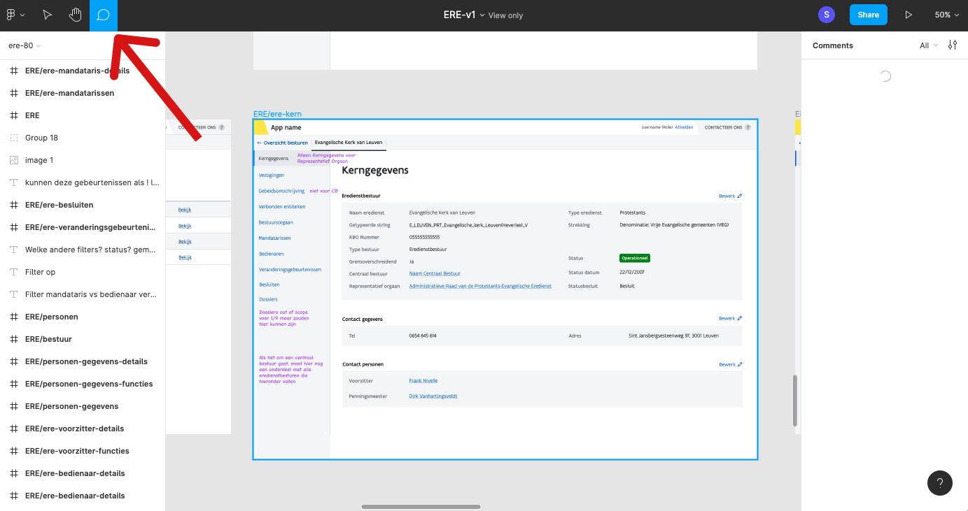
Met een muis: Om te navigeren tussen de verschillen schermen moet je spatie en rechter muisknop tegelijk ingedrukt houden en je muis bewegen.
Met een trackpad: Als je een trackpad hebt, kan je heel makkelijk door de schermen in Figma navigeren, door met je vingers te slepen.
Om in te zoomen naar een scherm, kan je + of - op je toetsenbord gebruiken (dit kan verschillen per toetsenbord). Je kan ook rechts boven zoom opties vinden met verschillende toetsenbord sneltoetsen terug vinden.
Als je een trackpad hebt, kan je ook makkelijk in- en uitzoomen door je twee vingers van of naar elkaar te slepen.
Feedback geven via Figma doe je door comments te laten op schermen.
Een designer bezorgt een Figma link naar mockups. Om comments te kunnen schrijven, moet je eerst een account aanmaken.
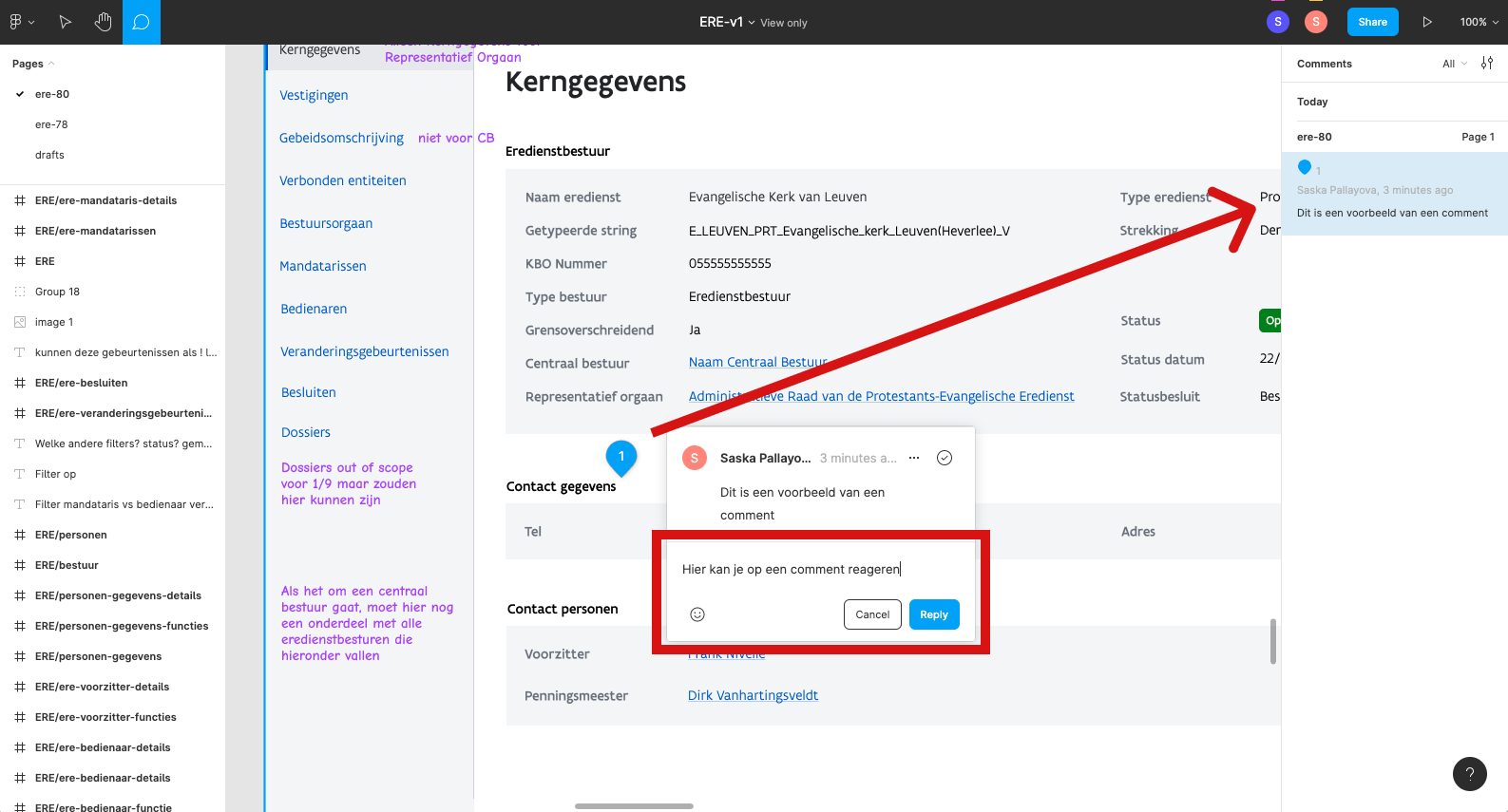
Eens je een Figma account hebt aangemaakt, kan je comments laten op specifieke plekken op de schermen.
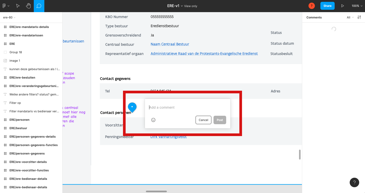
Om in comment modus te gaan, moet je op het tekst ballonetje linke boven klikken. Je muis zal dan in een pin veranderen. Deze kan je eender waar in het document plaatsen. Wanneer je dit doet, maak je een comment aan. Dan mag je daar relevante feedback schrijven.
Als je per ongeluk op de verkeerde plaats een pin zet, kan je op Cancel drukken, of ergens anders op de scherm klikken met je muis. Dit zorgt ervoor dat de pin verdwijnt.
Eens je je feedback geschreven hebt, mag je op "post" drukken. Dit maakt je comment zichtbaar voor iedereen die toegang heeft tot de Figma link. Je kan een lijst van alle comments zien op de rechter kant van je scherm, wanneer je in "comment modus" bent. Je kan ook reageren op comments en discussies starten.
